
Role
UX/UI Designer
Duration
4 weeks
UX Methods
User Research, Persona, Customer Journey, Prototyping, and Usability Testing
Tools
Sketching, Sketch
The Problem of Existing Bike Purchase Experience
The main problem of the existing purchase experience is that a lot of users are abandoning their purchases during their customer journey.
The product manager identified two key data points:
- 50% of the users open 7 product item pages but then exit the site and abandon the purchase.
- 70% of users place a product in the cart but abandon purchase at the registration page during checkout.
Design Goal
Improve the purchase experience to increase the conversion rate from browsing to checkout.
Learning From Industry Leaders
I reviewed the purchase experience from three industry leaders to examine what they are doing to ensure a smooth customer journey.
Amazon is one of the major e-commerce sites that is used by most people to shop for anything and everything.
- Clear call to action button to guide the customer along each step
- Filters are relevant to what customer is searching for
- Comparison between products is very simple but identical for all product types
- No guest checkout but all information is stored for one-click purchase
Target is another popular e-commerce site that focuses on selling home goods to clothes.
- Stock information is visible on the search results page.
- Well organized information on the product detail page
- The section showing similar products is helpful for customer research
- No clear way to compare products without opening multiple pages.
Trek is a bike e-commerce site that sells specific brand-name products.
- Information is tailored for cyclists
- Ability to compare multiple bikes in the search results
- For buyers who are not sure which bike to buy, there is a help me choose section but it is not very visible.
- Stock information is not visible until the user selects size and color
Understand The Purchase Experience
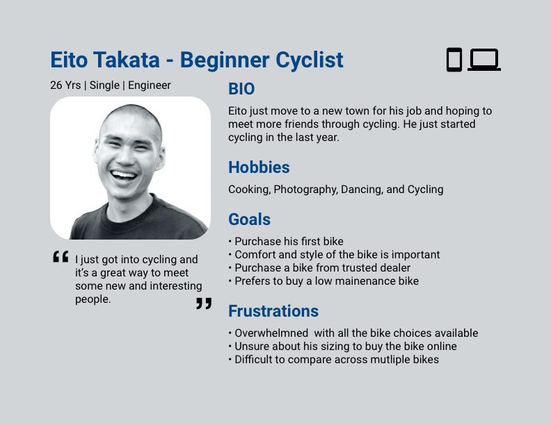
To improve the purchase experience, I need to first understand the customer journey. I recruited 8 people for user interviews. Half of them are cyclists and have owned a bike before. The other half are people who frequently purchase products online.
Insights
Bike Purchase
Knowing your size before buying a bike online or in-person.
“I have to click into the bike detail page and select the color and size before seeing if the bike is in stock.”
“I want to see a lot of information about the bike such as pictures, material, source, or videos to help me decide what to purchase.”
Online Purchase
Desktops are used most often when buying expensive items online because there is more space to open several pages.
Opening several product pages but buying because of research/comparison or just browsing and not confident in buying.
“I don’t want to create an account because I have to remember yet another username and password or I would get spam emails.”
Areas of Opportunity
Provide size guideline in bike detail.
Color and size stock information is visible in search results.
Product details should be neatly organized and easy to find.
Simple checkout proccess that uses email to start.
Provide compare function to users to review up to several bikes.
Based on the insights from the user interviews I created two personas that matched with the target users.
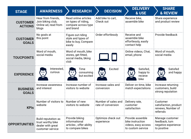
From the personas and the reviews of the industry leaders, I created a customer journey to map out a successful bike purchase experience.
Based on the customer journey, I created two user flows. One to map out how customers would search for a bike and add it to the cart. The other is to map out how customers would check out.
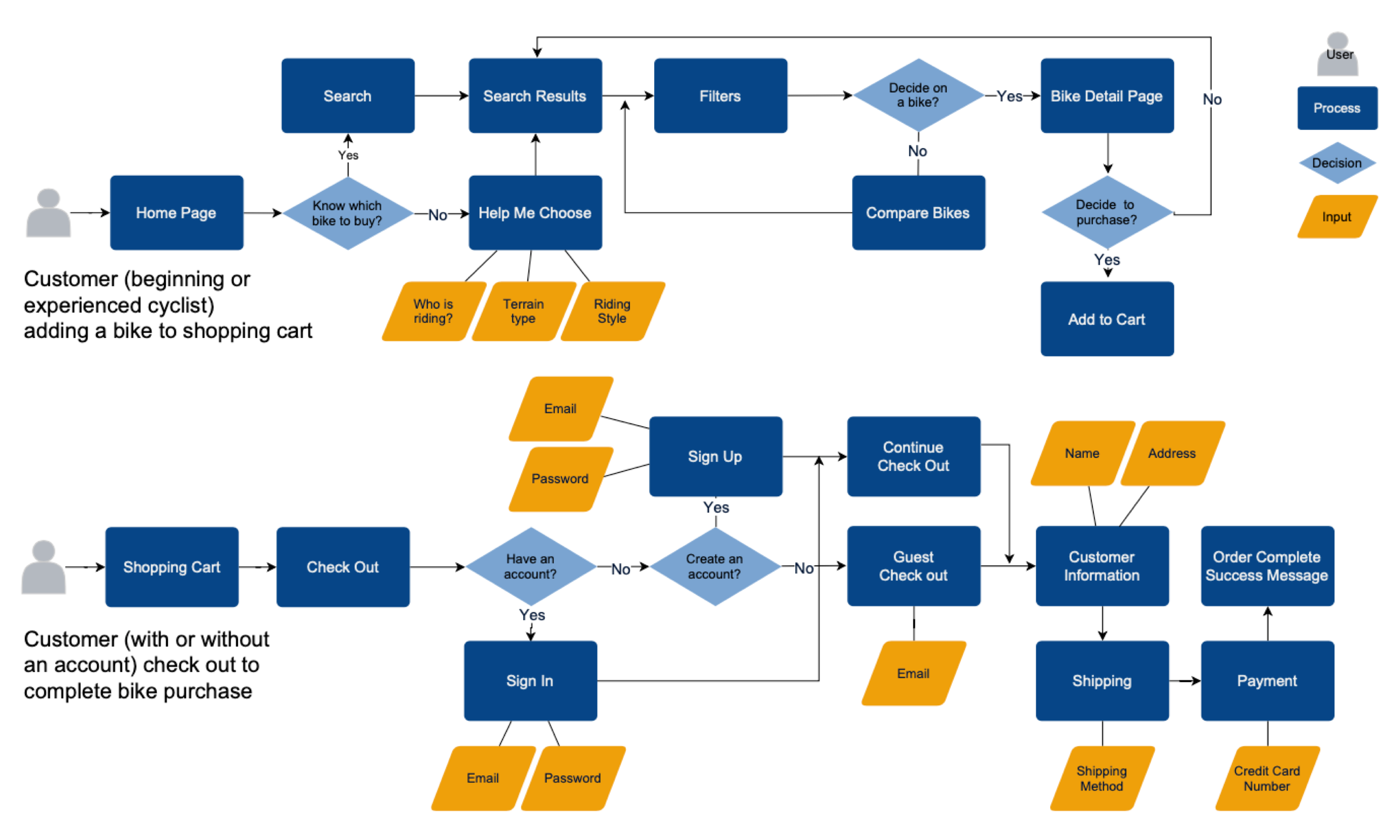
How Might We Improve The Purchase Experience
- How might we allow customers to easily compare different bikes?
- How might we show stock information to allow for quick scanning?
- How might we simplify the registration process to improve the checkout experience?
- How might we organize product information to help buyers speed up their research?
Brainstorming And Exploring Different Layout
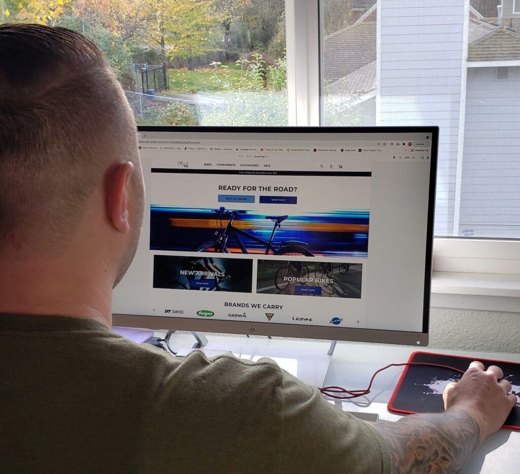
As 80% of the participants in the user interviews stated that they prefer to use a desktop computer when buying an expensive item, I decided to focus on improving the web purchase experience and sketch out some ideas for different layouts.
Experiment with different components on the homepage for a clear call to action.
Explore how to show the bike comparison experience in the search results.
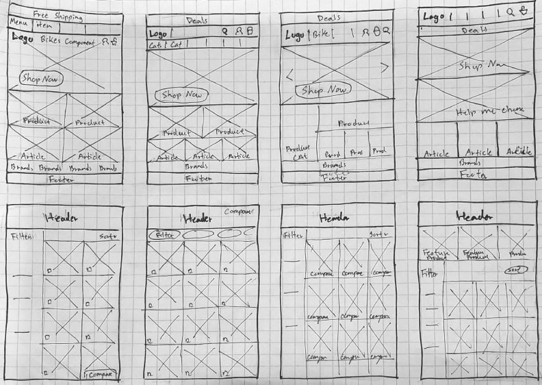
Organize product detail in different ways to see how to present large amounts of information in a simple way.
Test out different layouts for the registration at checkout.
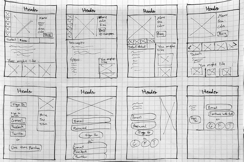
Low Fidelity Prototype
After the brainstorming session, I created a low fidelity prototype with the focus to address quick scanning of stock information, bike comparison, organized product information, and a simple guest checkout experience.
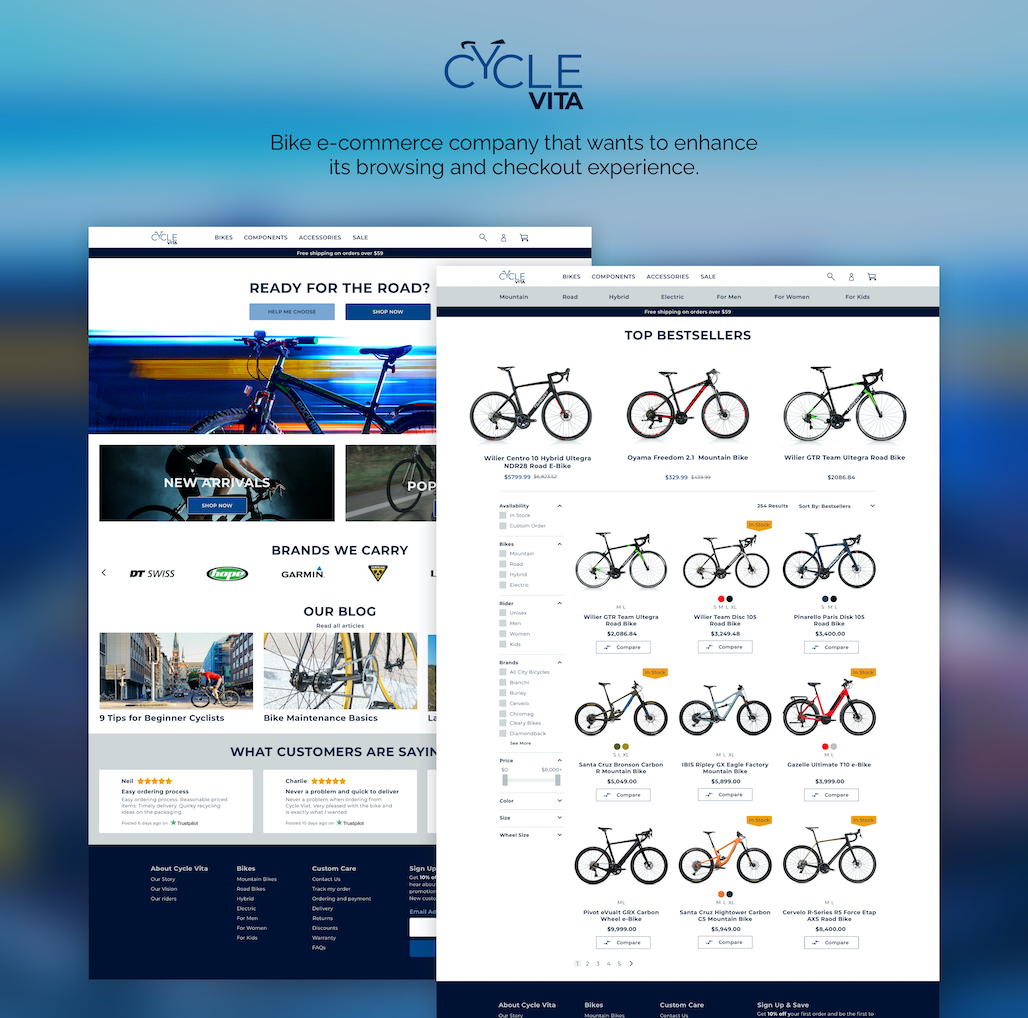
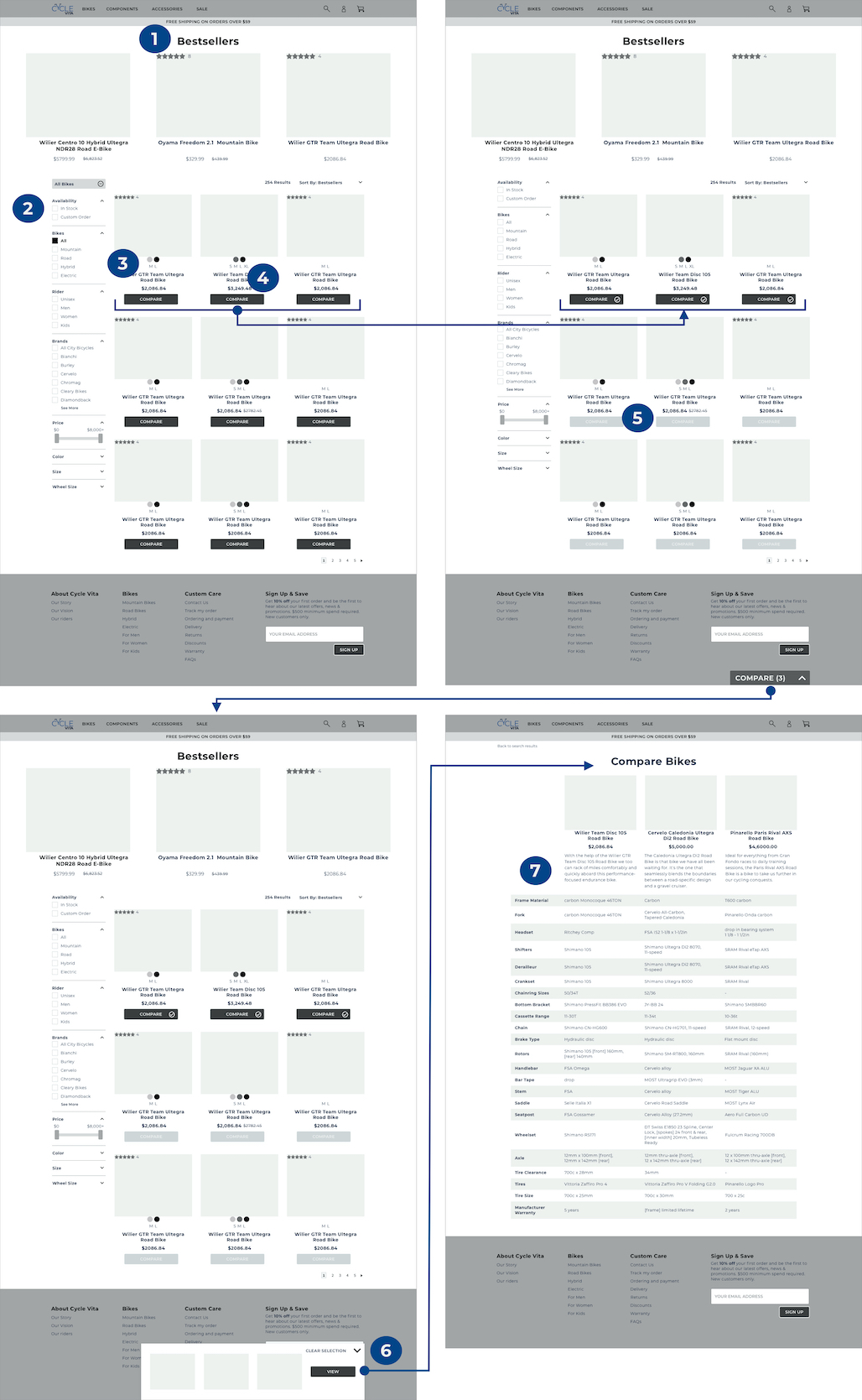
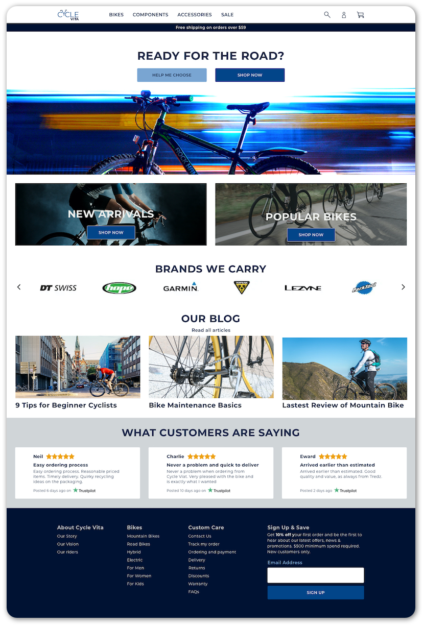
Quick Scanning and Bike Comparison
- Featured bestsellers are bigger in size to draw buyers’ attention.
- Filters are organized based on insights from user interviews on factors to consider when buying a bike.
- Color and size are visible on the individual bikes to allow for quick scanning of stock availability.
- Customers can compare bikes by selecting the one they want to view.
- Only 3 bikes can be compared. After the third bike is selected, the rest of the compare buttons are disabled.
- Bikes added to the compare list can be previewed in the Compare floating button.
- Bike specifications are organized in a table format to help customers research and narrow down a selection.
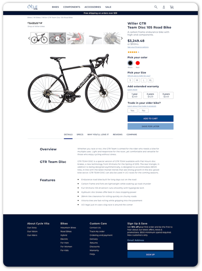
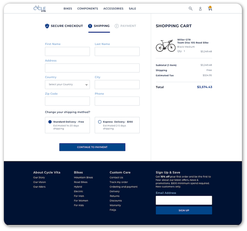
Organized Product Details and Simple Registration
- Easy access to the gallery for close-up viewing of bike images and videos.
- Buyers can customize the order.
- Product details are organized for ease of review.
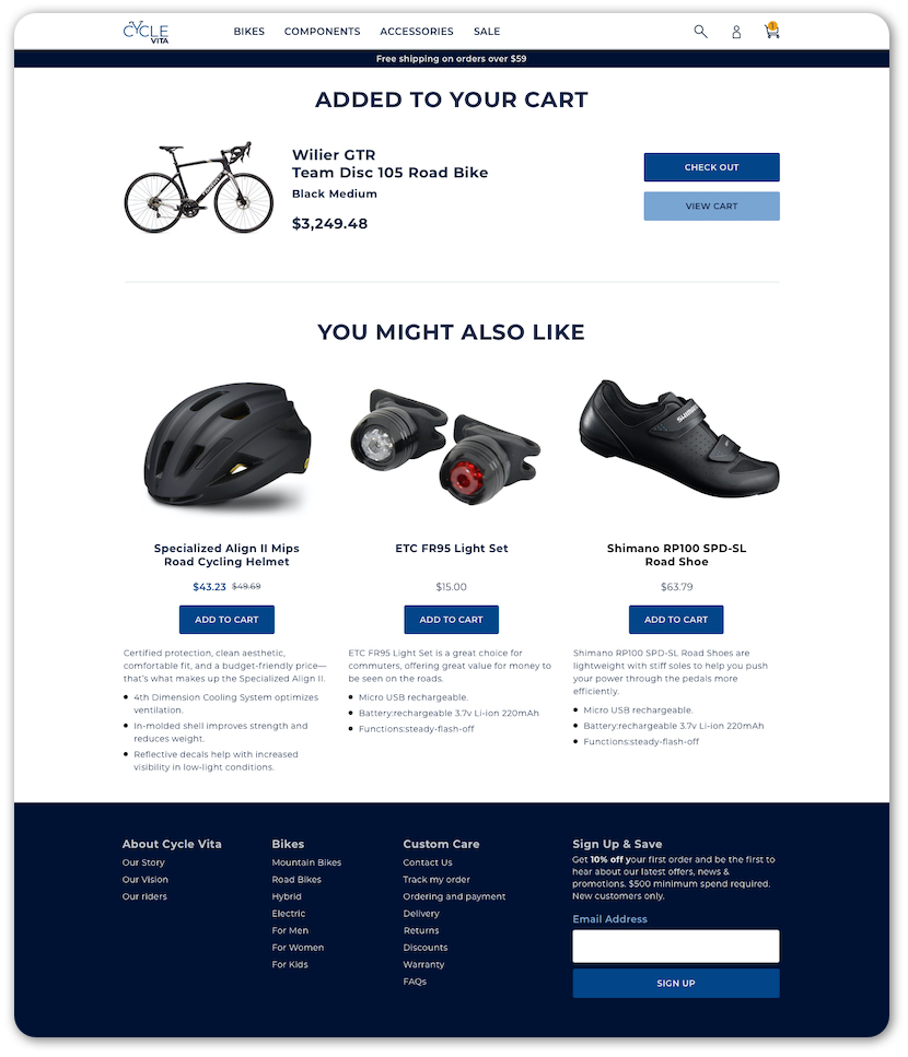
- Related products are suggested to buyers after a product is added to the cart.
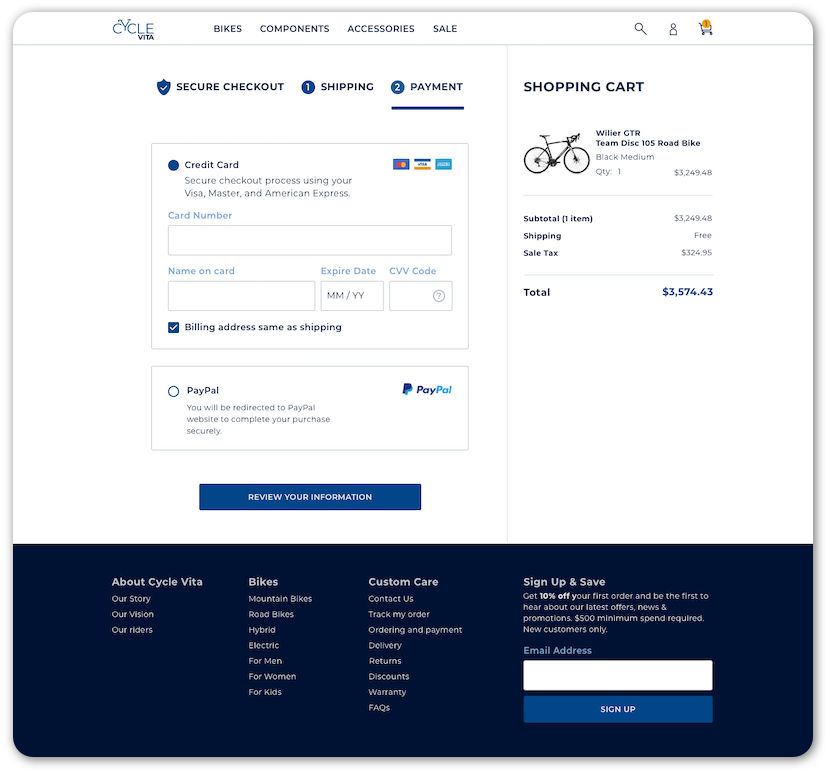
- The shopping cart is visible during the entire checkout process.
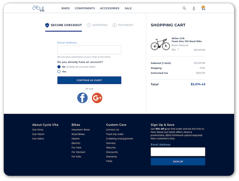
- Simple checkout registration with email or social media accounts
- Users with accounts can also sign in before the next step.
- Users utilizing the guest checkout can create an account after a successful purchase.
Testing Out The Initial Flow
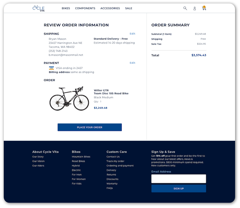
I recruited 4 participants who are bike owners that expressed some interest in buying or researching for a bike in the near future to test out the low fidelity prototype. Overall all the feedback was positive but one of the major usability issues discovered is the missing review step before placing the order. This missing step was included in the high fidelity design.
The Brand
Cycle Vita is an expert in this field, knowledgeable about the latest trends and best products related to biking.
Attributes: Savvy, Focused, Serious, Dependable.
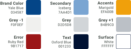
Colors of Cycle Vita
In order to focus on brand personality and attributes, I decided to use Yale Blue as the primary color and brand color with accents in the complementary color of Marigold.
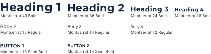
The Logo and Font
Montserrat is a san serif type with a geometric shape that creates a feeling of trust. Cycling is a unique culture and a way of life. The logo is created with Montserrat with a play on the image of a bicycle.
High Fidelity Prototype and Usability Testing
After updating the flow based on the results of the first usability testing, I created the high-fidelity prototype. Then I recruited 5 participants who are online shoppers for the second round of usability testing.
The second round of usability testing uncovered minor usability issues which have been incorporated into the prototype.
Minor usability issues include:
- A visible separation between top bestsellers and the search results
- In stock label applied for easier scanning
- A visible checkmark to show the default selection of billing same as the shipping address
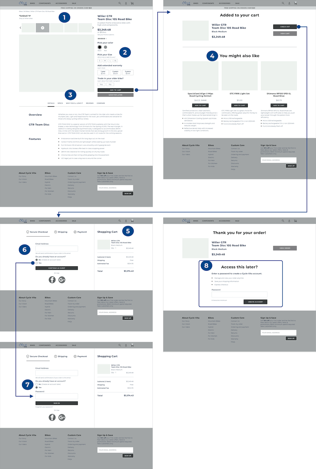
Updated High Fidelity Design
Homepage
Search Results
Product Details
Item Added to Cart
Checkout
Item Added to Cart
Payment
Review Information
Next Steps
The new design will help customers to do some basic comparison across the technical specifications as well as provide a guest checkout to reduce account creation fatigue.
To measure success, several metrics should be measured after the design deployment:
- Reduction of the site exit rates at the checkout page
- Increase of sale conversion rate
- Reduction of the shopping cart abandoned rate
Bike purchase is a complicated process especially when customers are shopping for one online. To ensure Cycle Vita can help customers narrow down their ideal bicycle and commit to the purchase, more user research is needed to understand what other important factors they use to compare across different bikes and incorporate that into the design.