
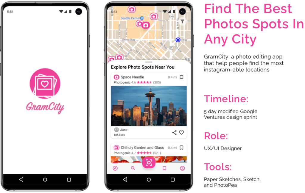
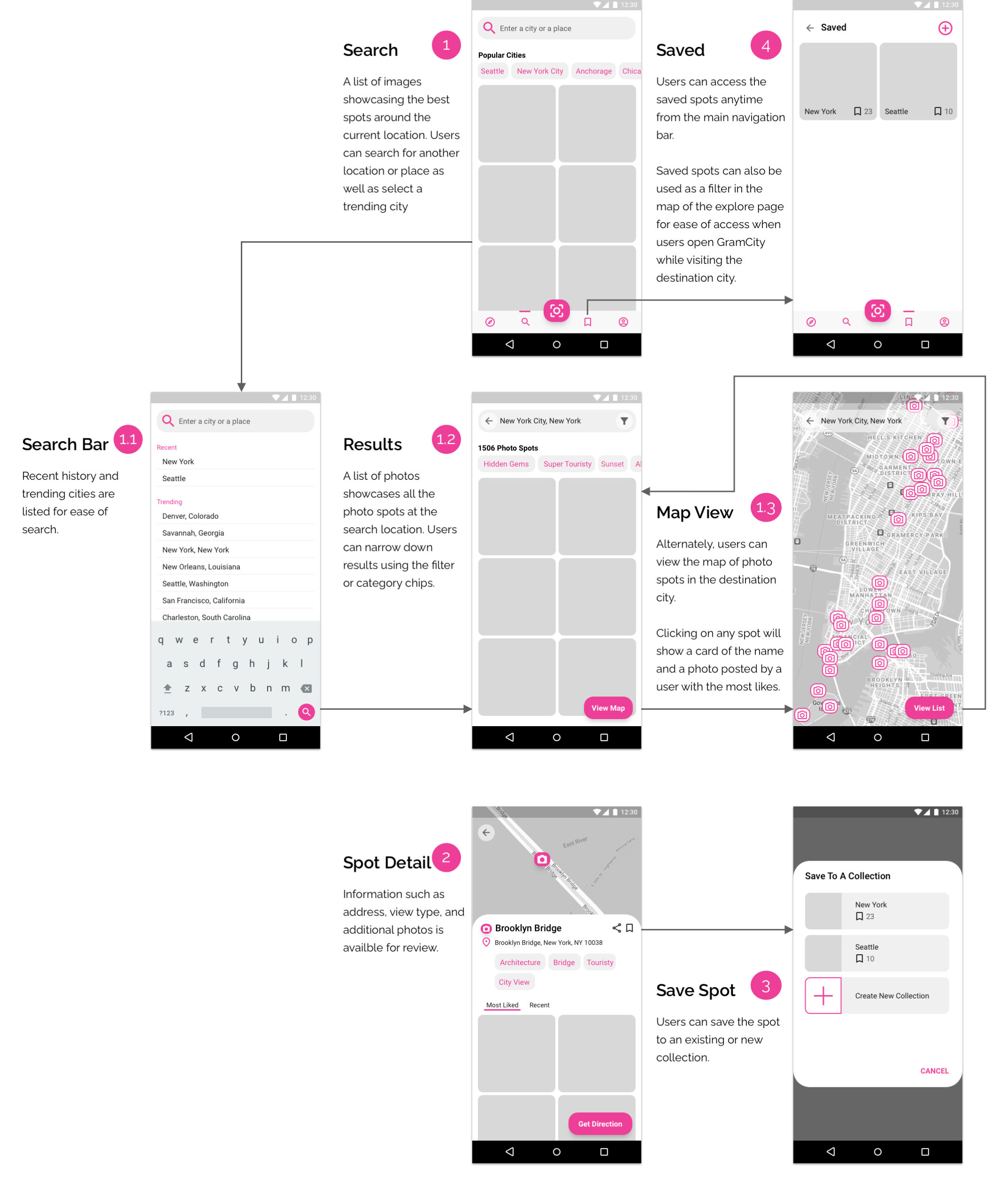
The Challenge
GramCity is a photo editing mobile app that is designed to help users find great photo opportunity spots in any city. I followed a modified GV design sprint to quickly create and test out a possible solution in five days.
Design Constraints
There were two areas of focus for the design sprint:
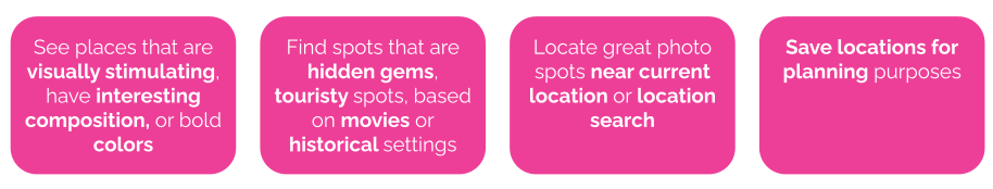
- Help users find physical places and locations for photo opportunities
- Create a community for users to find and share their favorite locations
Given that the design sprint is only five days, I decided to focus the solution design around how and where users can find photo spot locations.
Design Sprint for One
Normally, the design sprint involves a team of diverse skills and roles. However, I was the only resource on the project since this is a modified design sprint.
The five-day design sprint includes the following:
- Day 1: Understand the problem
- Day 2: Brainstorm ideas
- Day 3: Decide on the solution
- Day 4: Create a prototype
- Day 5: Test
Day 1: Understand The Problem of Locating Photo Spots
Synthesize User Research
Before mapping out the problem, I did a deep dive into the data gathered from the user research. Below are some of the key highlights:
Review Personas
There are two personas developed from the user research. One is the explorer, who is more spontaneous when looking for photo spots. The other is a planner and prefers to plan photo spots before traveling.
Goals of the Explorer:
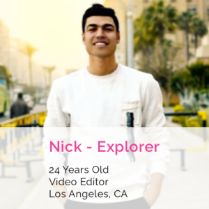
- Find great photo spots to document the trip
- Doesn’t want to spend too much time doing research
- Prefers to find photo spots along the way
Goals of the Planner:

- Easily find photo spots
- Needs to see examples of the best photo spots in the city
- Prefers to plan before going to all the best photo spots
“How Might We” Questions Addressed In the Design Sprint
- HMW easily find photo spots based on a destination city or based on the user’s current location?
- HMW see the best examples of photo spots?
- HMW save photo spots for planning purposes or share with friends?
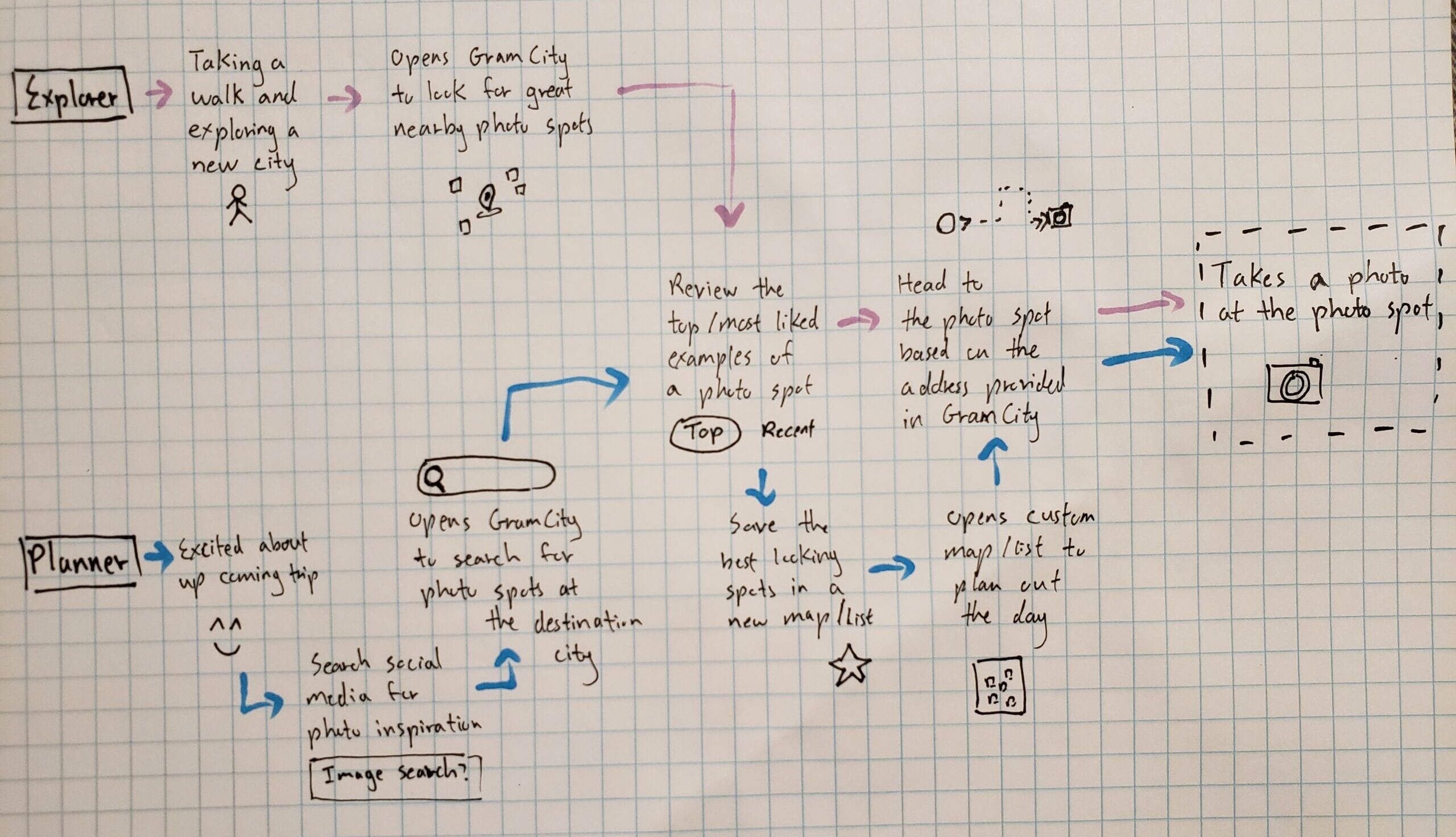
Map Out End to End Experience of Locating Photos Spots
Based on the two personas, I mapped out the end-to-end experience for the planner and explorer.
Day 2: Brainstorm and Sketch Out Solution Ideas
Lightning Demos of Similar Applications
Based on user research highlights, the user base of GramCity is highly visual and wants to find or search photo spots based on location. I performed a lightning demo of existing products that have similar functions, and I looked at applications focused on photos and images such as Instagram and Pinterest. I also reviewed applications that have a great map search feature such as Google Map and Best Parking.
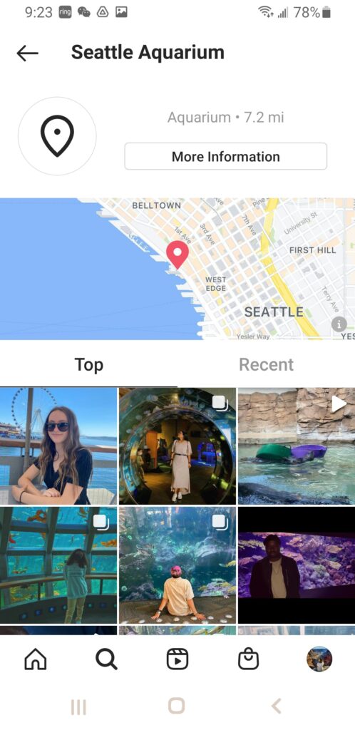
Instagram is a social media platform that focuses on taking and sharing photos in the community. When searching for a location, Instagram separates the photos into groups from top and recent. The organization helps users quickly browse through the images to identify visually pleasing photos. There is also a preview of the location on a map.
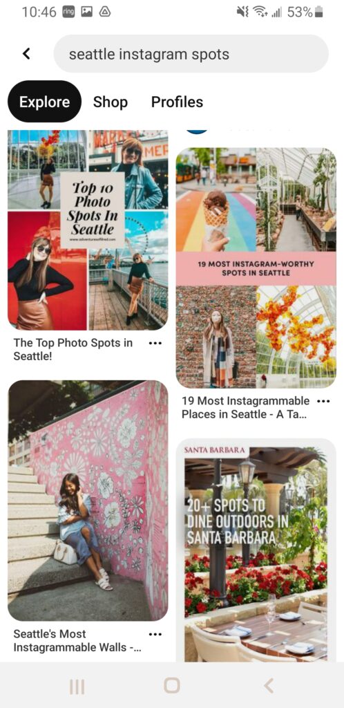
Pinterest is another image-driven platform for sharing ideas. The layout of Pinterest is very simplistic to allow users to focus on the images. When searching for ideas, the results are returned in a layout that is uneven to accommodate different sizing. However, the uneven layout also makes the images look like a collage creating visual interest.
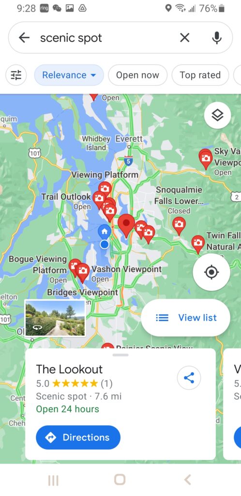
Google Maps is great for locating places on the map. It provides a reference of where you are and the locations you are searching for. When you click on the individual icon, there is some basic information about the location as well as the ability to share and get directions to the spot.
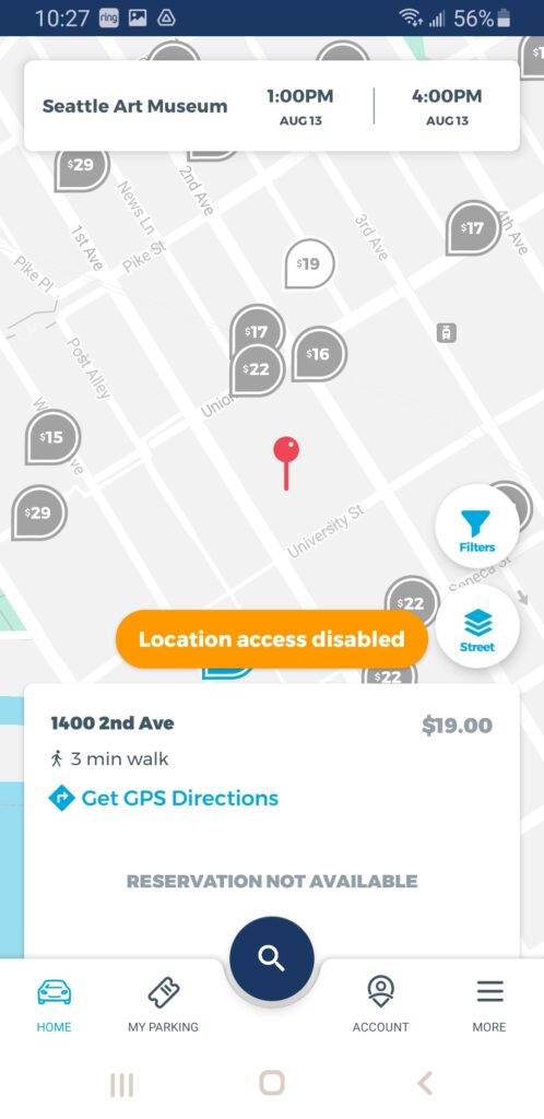
Best Parking is an application that helps users locate the best parking spot. The spot location feature is similar to what GramCity is trying to achieve. It also provides the cost of parking for each spot so you can see which is the cheapest parking spot at a high level.
Brainstorm Solutions on Finding Photo Spots
Looking at the steps in the mapping, the main screen is where a user can browse through photo spots nearby. The main screen is the first screen that the user will see after opening the app. By drawing the crazy 8 sketches, I brainstormed ideas on where the main screen will only focus on photos taken by other users, or a map showing nearby photo spots, and a mix of both.
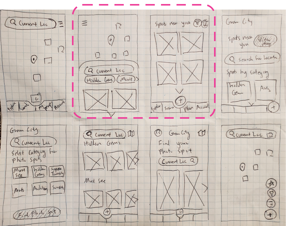
Reviewing the goals and user personas again, I preferred the idea of showing all visuals and a mix of the map and photos, as the best out of the eight ideas. As a result, I created a solution sketch for both options. Since the crucial screen is the initial one that the user views, I decided to sketch out the two steps following the crucial screen.
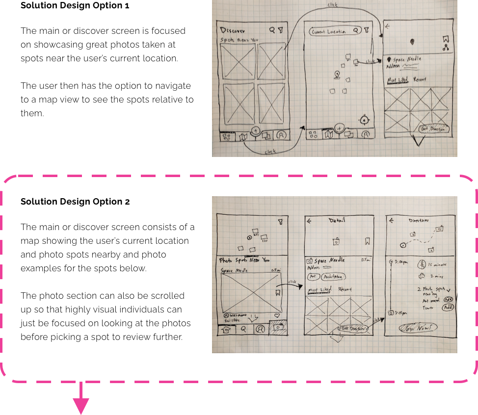
Day 3: Decide on The Solution
After reviewing the two personas again, I decided to go with solution option 2 with a mix of a map and photos on the explore page. It fits with the goals of the explorer in not wanting to do too much research as well as the planner who prefers to plan out their day once at the destination.
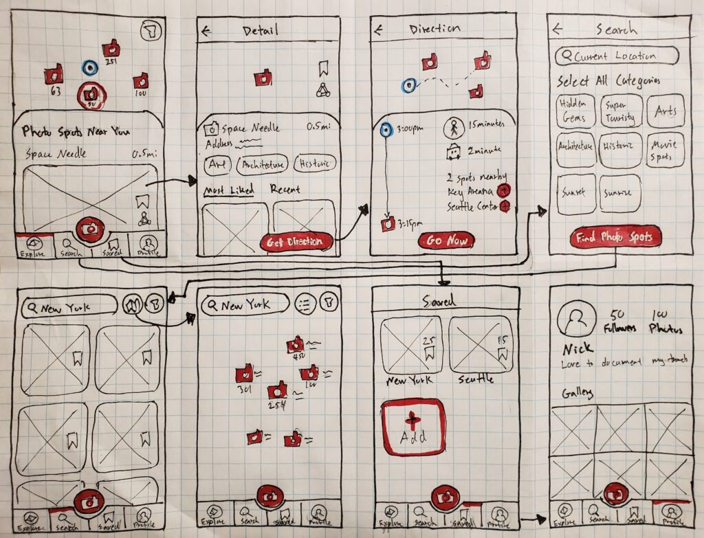
Below is a storyboard of the solution that would take the user from locating the spot, directing them there, and finally to the photo spot to take a photo.
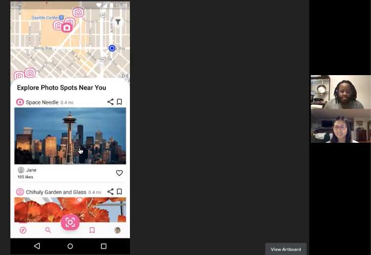
Day 4: Build a Prototype
I used Sketch to create a prototype with the focus on helping both the explorer and planner locate their next photo spots. Below is what the prototype looks like before putting in all the photos.
Explorer Using GramCity to Find Photo Spots Near Current Location
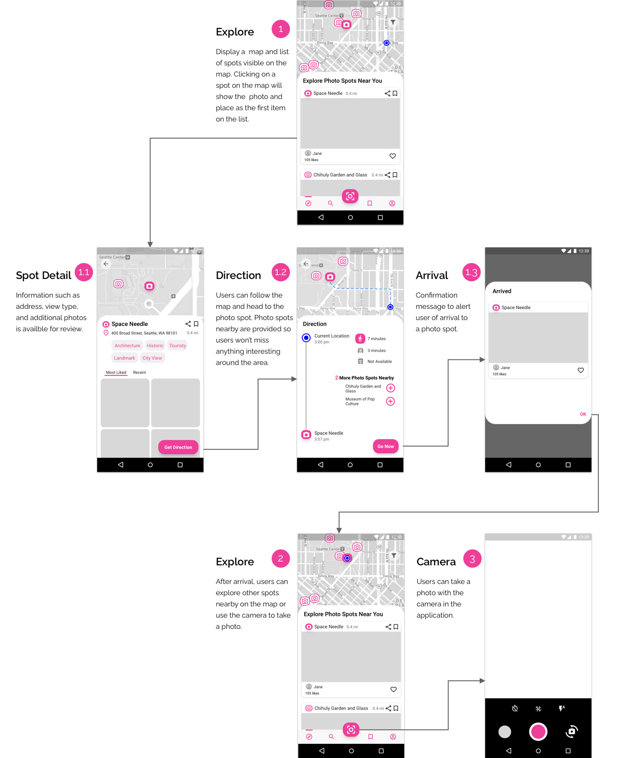
Planner Using GramCity to Find Photo Spots in Future Destination
Day 5: Test The Prototype
I recruited five people who have a combination of enjoying the outdoors, traveling, and photography for the user test. I started each interview by asking them about their job and hobbies. Next, I asked about the last time they had to look for a photo spot and any frustrations or issues that arose from it. I then proceeded to show them the prototype.
Additionally, I asked them to complete two activities acting as both an explorer and a planner:
- Locate a photo spot that is closest to you based on your current location
- Find photo spots based on the destination location that you will travel to in two weeks
All the participants completed the two tasks successfully. They provided a lot of positive feedback as well as called out some confusion.
Some of the key user feedback included the following:
- Several participants felt that the “Call to Action” button failed to stand out against a colorful background
- Some participants expected the action of clicking on the address of a photo spot to take them to google maps or have the “get direction” button appear right next to the address
- There was mixed feedback between having the name showing or removed for a photo spot on the search page
- Some participants suggested that a rating system for each spot would be helpful for them to determine if it is worth their time to visit
Final Product
I incorporated all the feedback into the final prototype, with one exception. I decided against including the name of the location on the search page since there was mixed feedback and more user research was needed.
Reflection
I wasn’t sure what design could be accomplished in the five-day design sprint. I was quite surprised by how efficient the process was and what the final prototype looked like overall. I learned to turn down distractions and focus on the goal of the sprint in order to achieve the final prototype.