
My Role
UX/UI Designer
User Research
Prototyping
Interaction Designer
Usability Testing
Tools Used
Timeline
December 2020 to July 2021
THE PROBLEM: HIKERS SPEND A LOT OF TIME RESEARCHING FOR A TRAIL
Hiking is a great outdoor activity to take a mental break from the modern digital world. Before you go on a hike, you can spend a lot of time researching to find a specific trail.
You have questions that you want to address such as:
- Which trail do I pick?
- When should I go?
- Does this trail fit with my fitness level?
- How can I hike the trails that my friends are doing?
- How do I track trails that I want to hike or have already completed?
So you end up opening multiple browser tabs and spending hours and hours trying to find answers, leaving you feeling frustrated about the research process and confused about which trail to select.
DESIGN GOAL
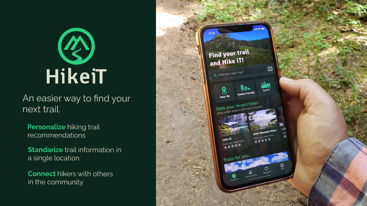
Create a trail researching platform that reduces trail research time from hours to minutes so people can spend more time in nature.
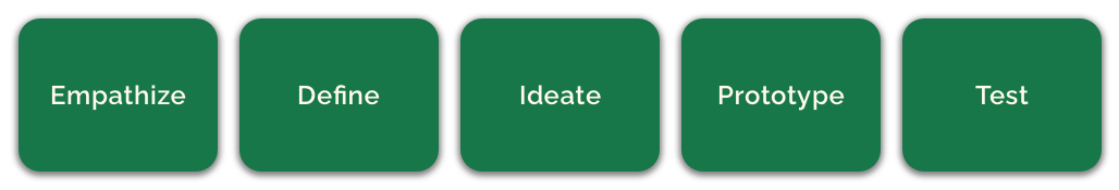
THE PROCESS
I want to understand what are some of the headaches and frustration related to the research of trails. I followed the iterative process of Design Thinking to create a solution.
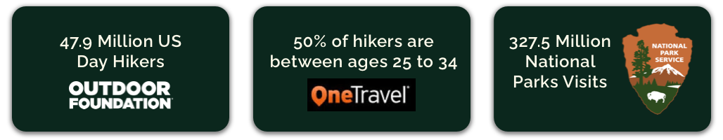
INITIAL RESEARCH ON HOW POPULAR IS HIKING
Hiking is one of the top 5 outdoor activities and increased in popularity in recent years.
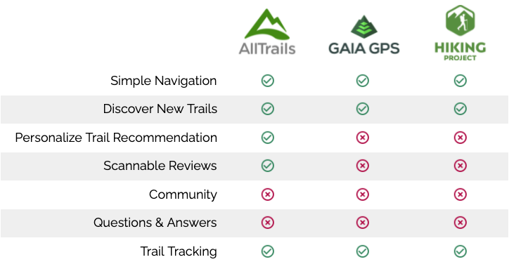
POPULAR TRAIL APPLICATIONS THAT PEOPLE CURRENTLY USE
I researched the top 3 popular applications that people currently use when they do trail research. I performed a heuristic analysis of AllTrails, Gaia GPS, and Hiking Project to see where there are areas of opportunity.
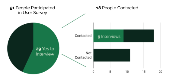
RECRUITING HIKERS FOR USER RESEARCH
I utilized a user survey to recruit participants for user interviews. My interview criteria for contacting people was to find someone interested in hiking, completed a hike or two before, or who has hiked a lot.
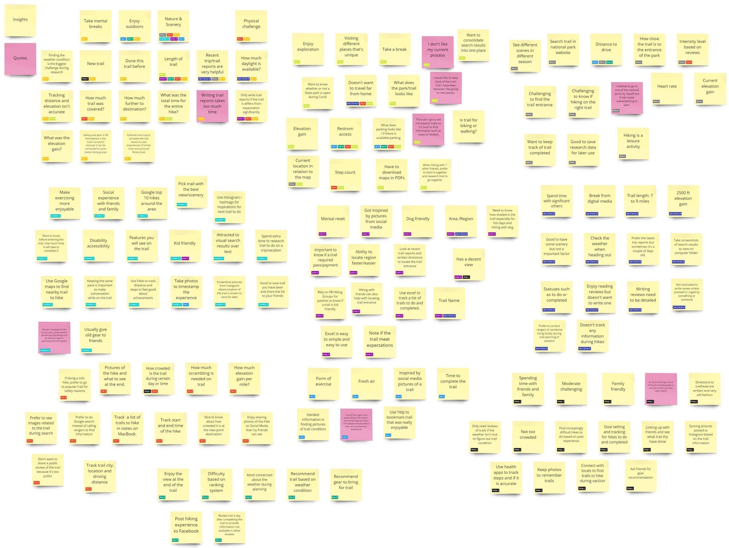
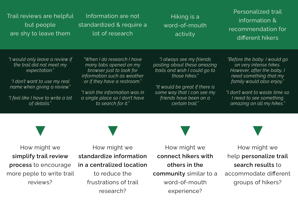
KEY INSIGHTS ABOUT THE HIKING EXPERIENCE
I organized the findings from the user research in an affinity diagram.
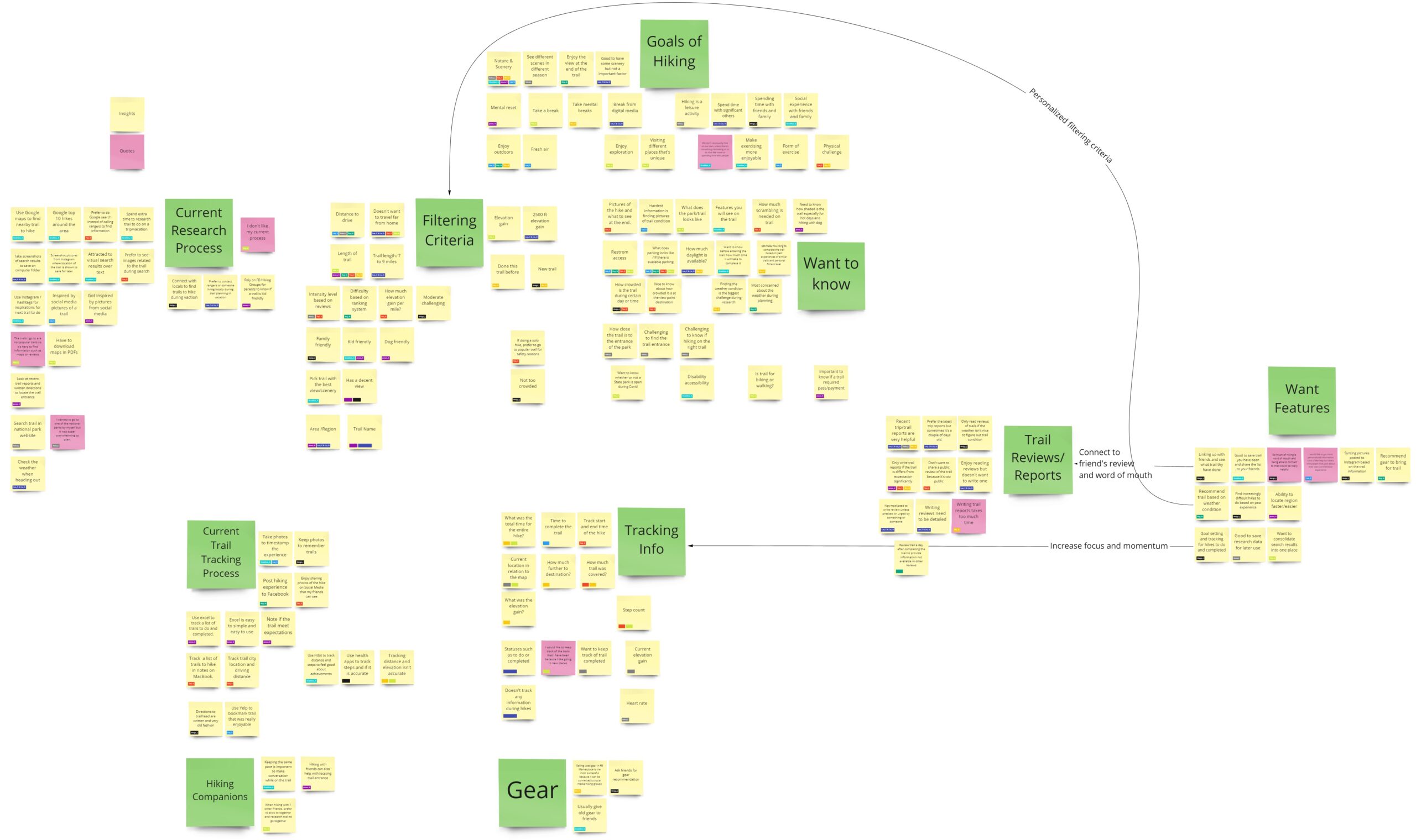
I redefine the problem of planning a hike into four how might we statements based on key insights.
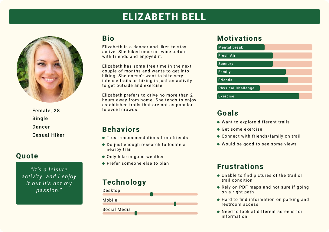
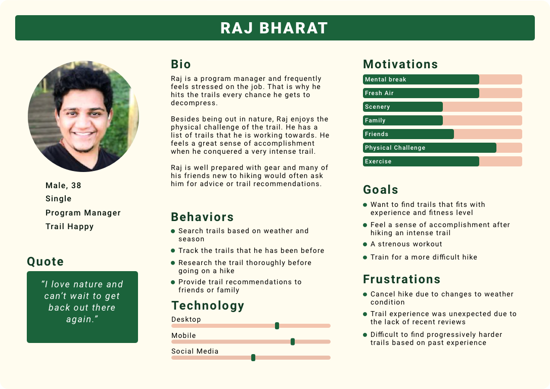
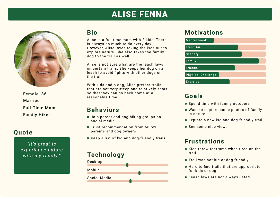
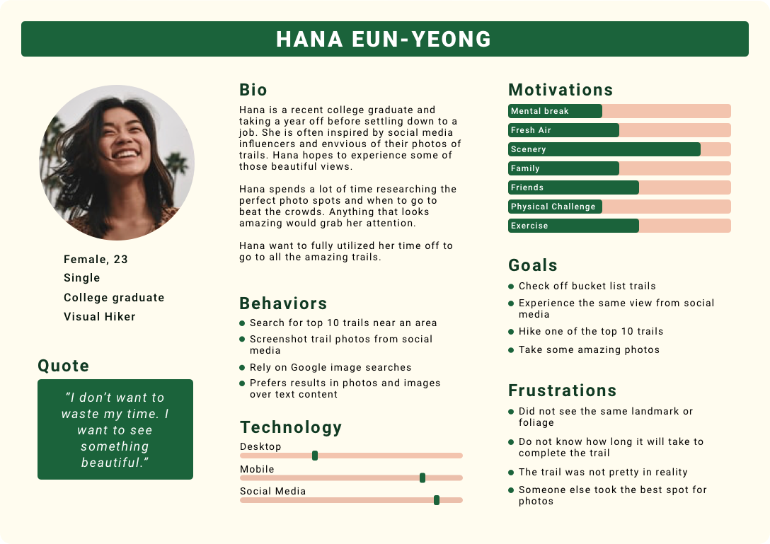
EMPATHIZE WITH USERS & DEVELOP PERSONA
Based on the user interviews, I identified four types of hikers and created an empathy map for each one. Using the empathy maps, I developed a persona to capture the different motivations, goals, and frustrations for trail planning and researching.
BRAINSTORMING IDEAS
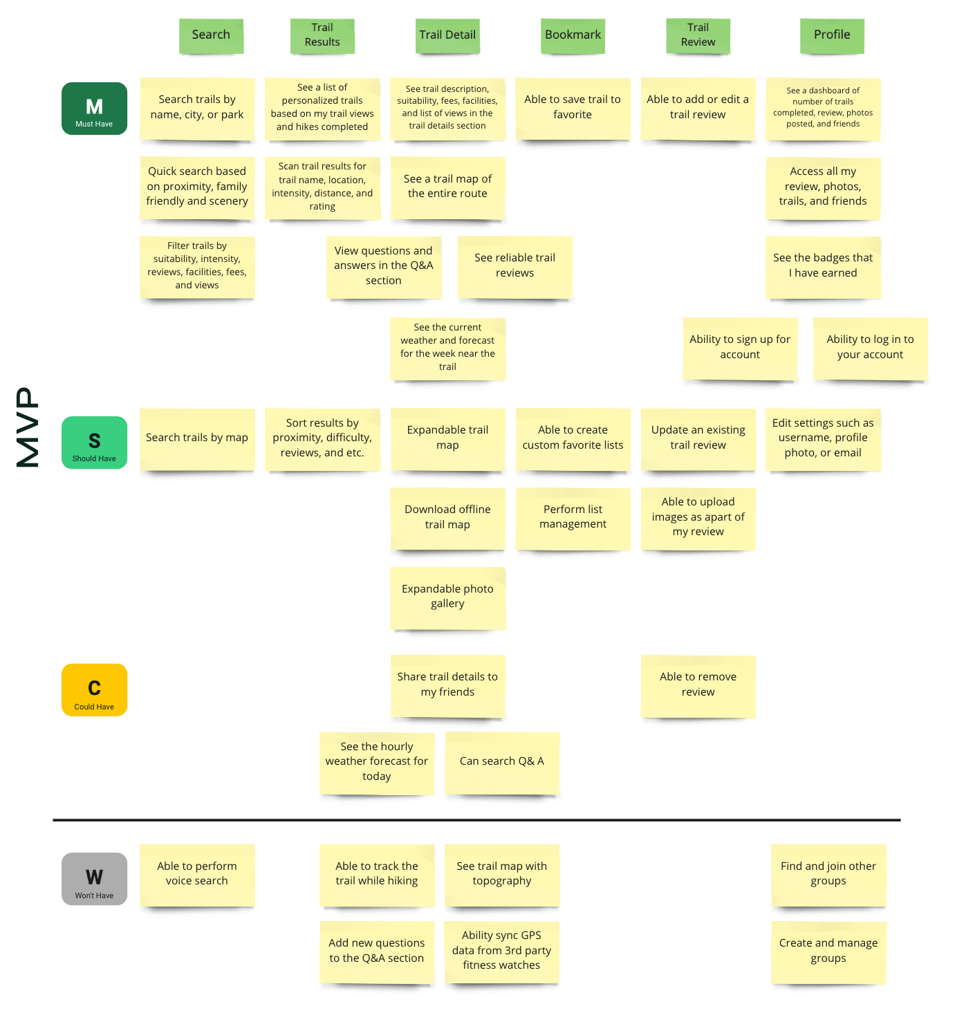
USER STORIES OF A MINIMUM VIABLE PRODUCT
After brainstorming some ideas, I created a list of user stories that focuses on three activities that a returning user will interact with the application. Then I used the MoSCoW prioritization to sort out the features that will be included in the minimum viable product (MVP) release.
At the minimum, a returning user can search for a trail to save it, add a review, and view reviews from other hikers in the community. These user stories are grouped under the must-have section.
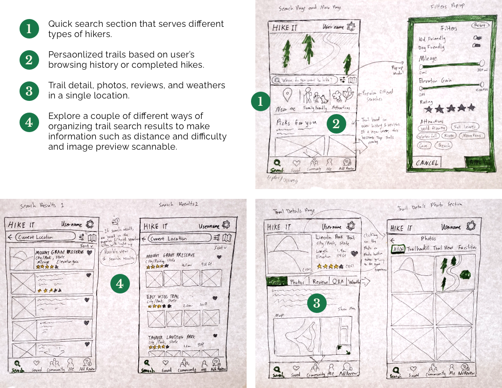
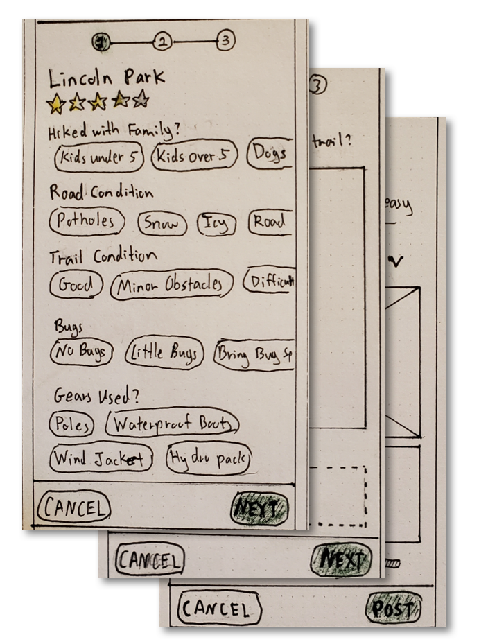
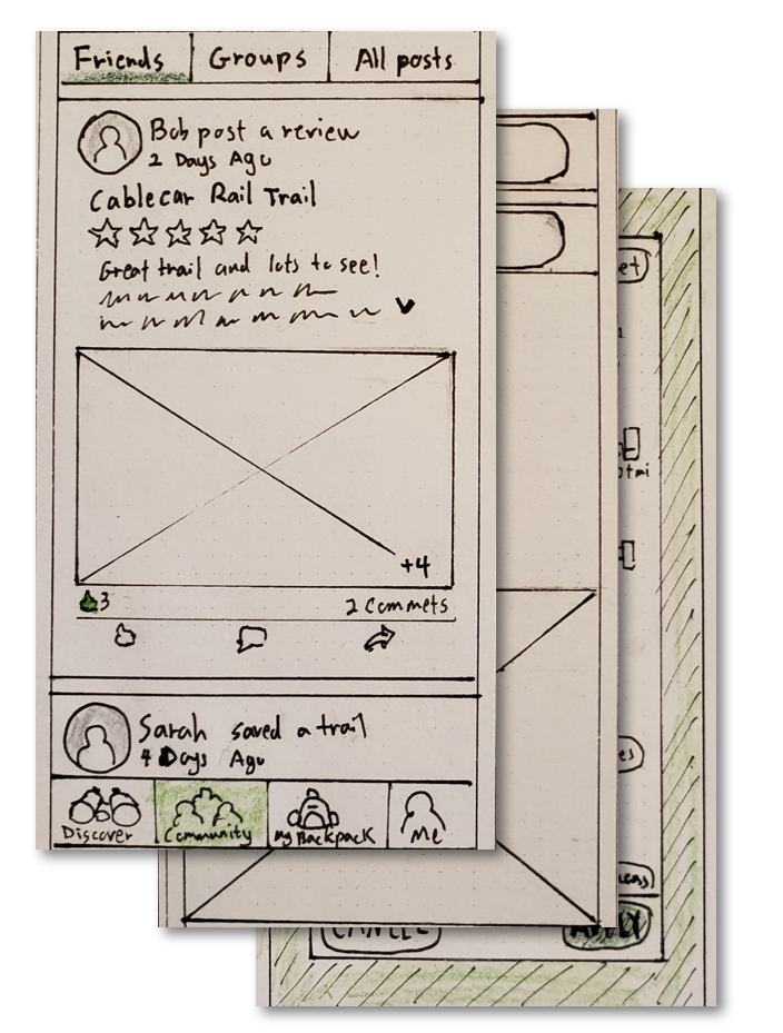
PAPER PROTOTYPE AND USABILITY TESTING
As MVP is the main focus, I created user flows for a returning user to complete three activities in the application.
- Search for a trail for the next hike
- Submit a trail review
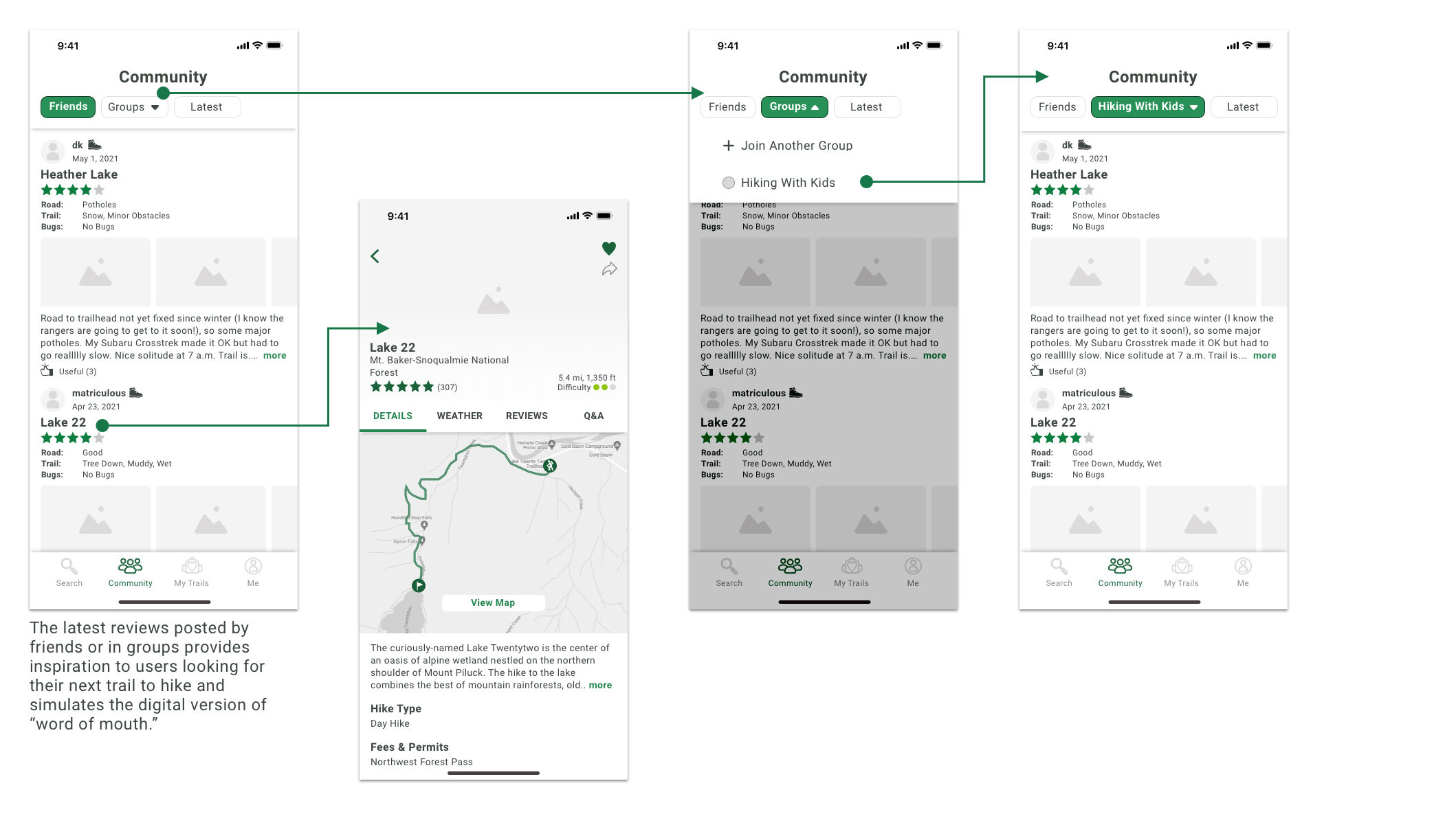
- Look at reviews from other hikers for inspirations
Based on these user flows, I sketched out all the screens and created a paper prototype. Then I recruited 6 participants for usability testing.
Usability Testing Feedback
The usability testing provided a lot of constructive feedback regarding the experience of each user flow. I noted the key insight from the usability testing below.
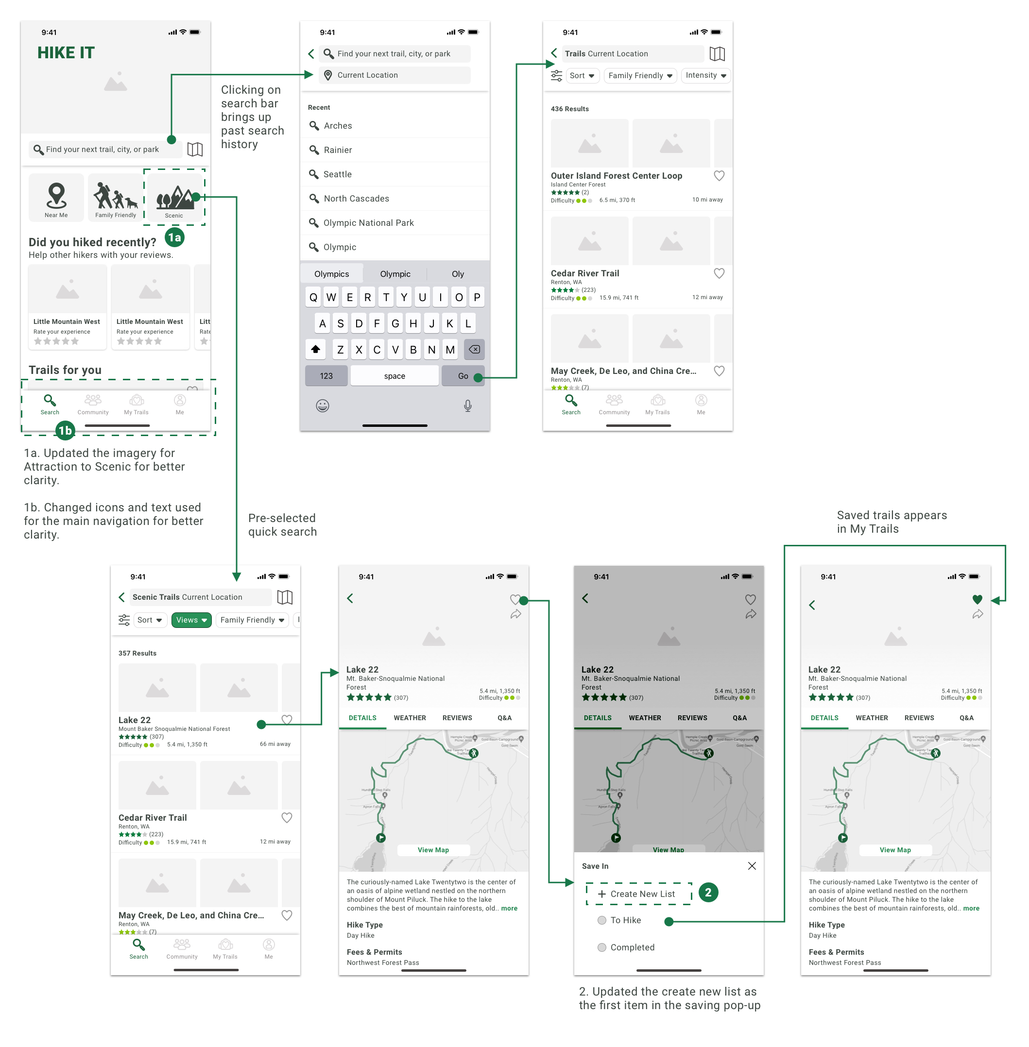
- Participants were unsure what the imagery and text for Attractions in the quick search section represented. Also, there were some confusion what some of the icons in the main navigation represented.
- The create a new list selection in the bookmarking interaction was not very visible.
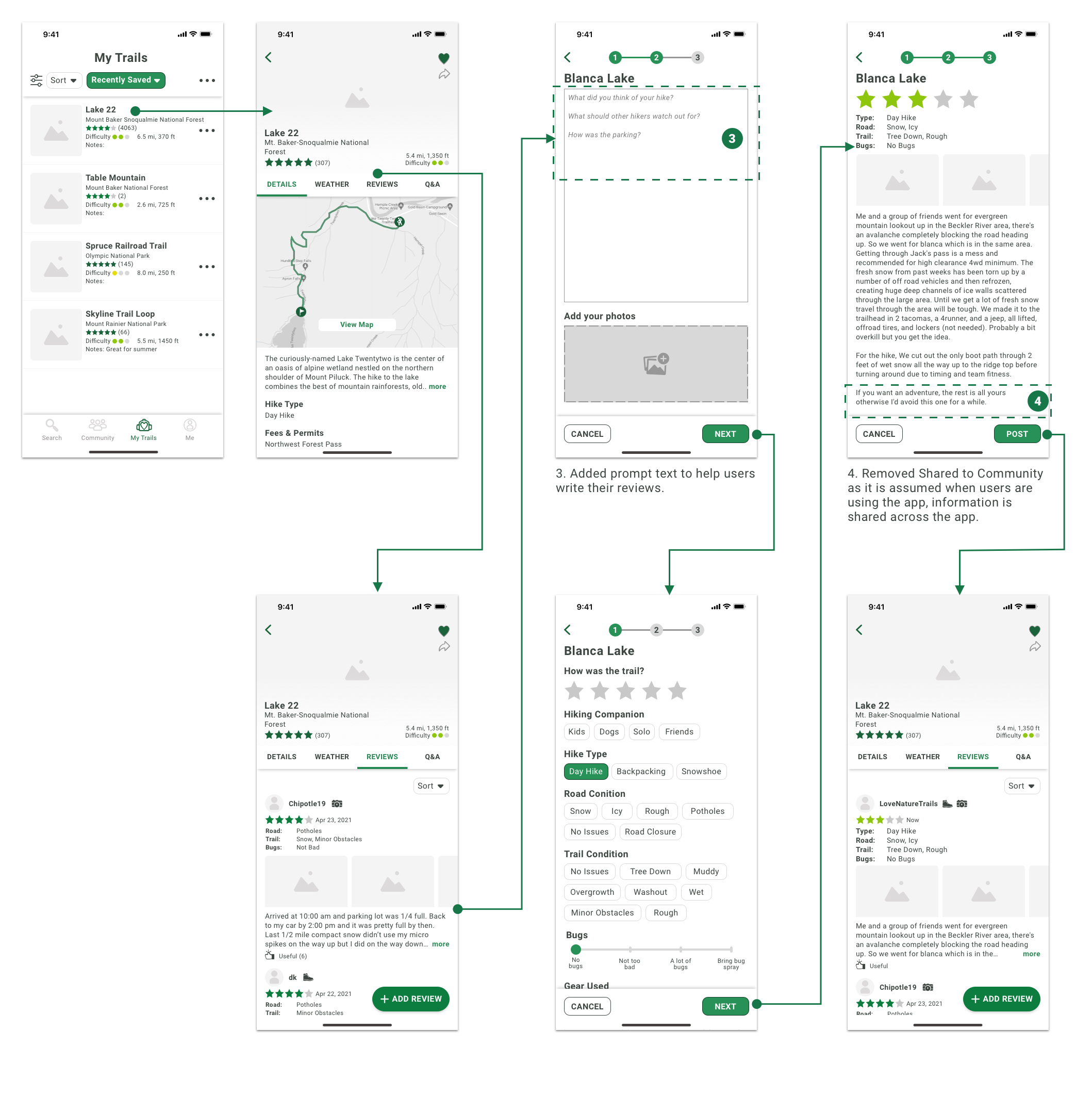
- Participants felt intimidated when looking at an empty textbox during trail review. They prefer to have some prompting to help with topics to write.
- During the last step of the trail review process, all participants were confused about what the Share to Community switch represented as they all assumed that their review should be available across the platform if they are using the application.
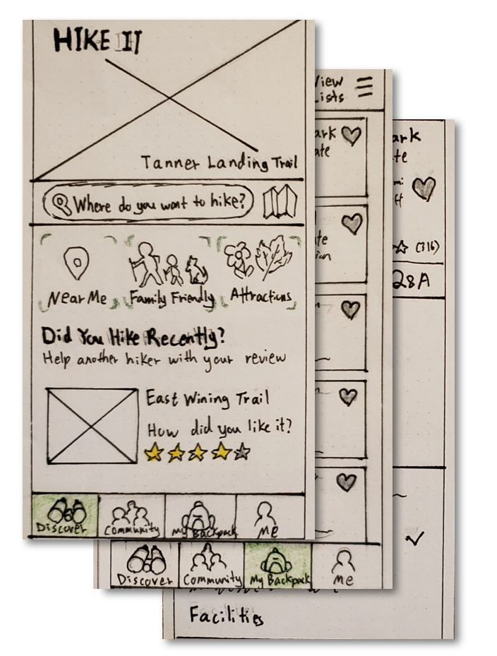
LOW FIDELITY WIREFRAMES
I incorporated the feedback from the usability testing of the paper prototype into the low fidelity wireframes and improved the overall layout.
Route 1 – Returning user looking for a hike for next weekend
Route 2 – Returning user adding a trail review for a trail previously saved
Route 3 – Returning user looking at reviews from other member
VISUAL DESIGN PROCESS
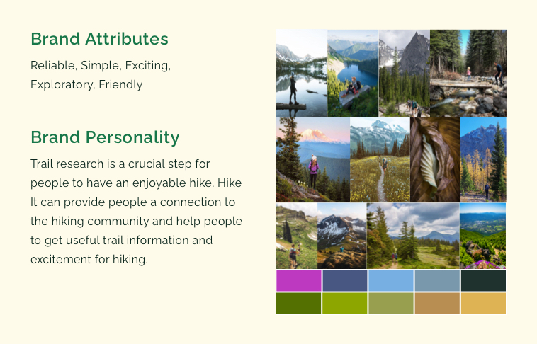
I created a mood board and style guide for some inspiration and coherence of the design of the high fidelity prototype.
Moodboard
Style Guide
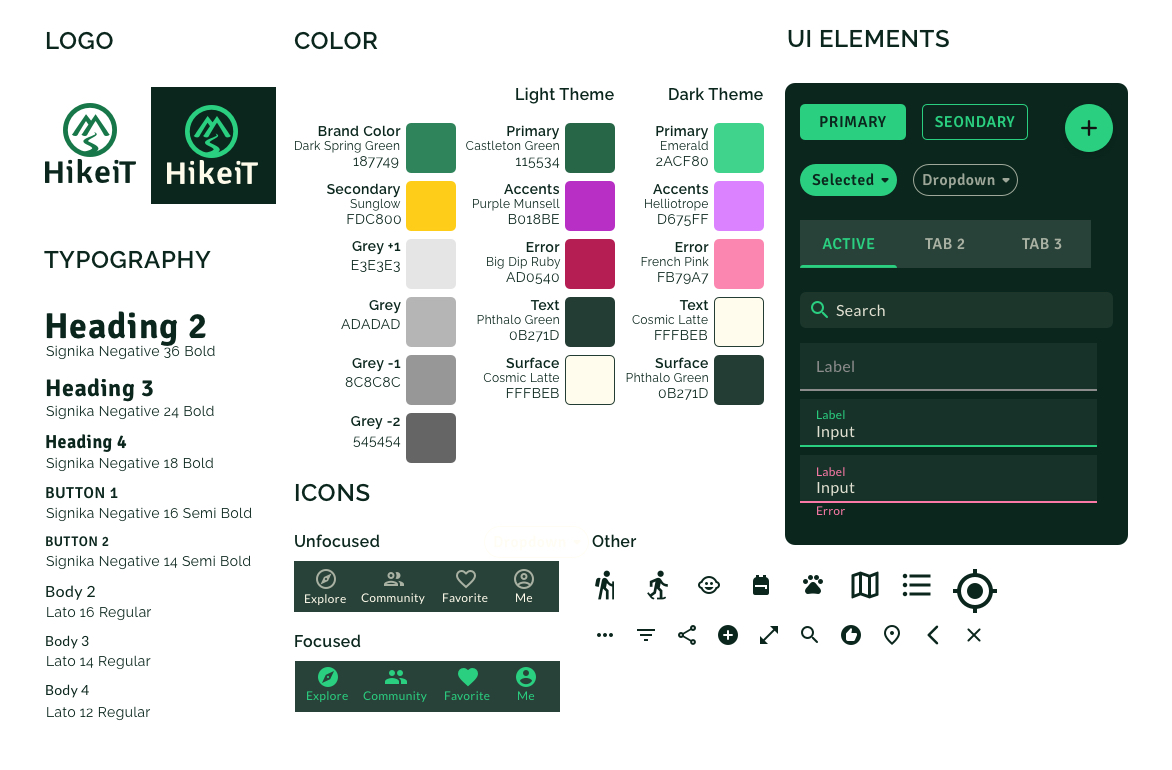
For the color, I created two palettes as I am uncertain which one to use. Based on my research, the dark text is more legible against a lighter background. However, I know the trail results will contain a lot of photos and images that will look better on a darker background.
The Decision to Use Dark Palette for High Fidelity Design
Since I am following the user center design approach, I did a round of testing with 6 participants to gather feedback on the color theme.
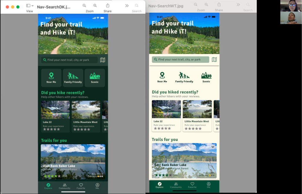
Based on the testing, 83% of the participants prefer the screen with the darker theme. These are also the same people that prefer to turn on dark mode on their mobile devices.
After testing, I was confident to use the dark-themed color palette to create the high fidelity prototype.
HIGH FIDELITY DESIGN & PROTOTYPE
After confirming the color palette with the user, I created the high fidelity prototype for usability testing.
USABILITY TESTING
I used the high fidelity prototype and conducted two rounds of usability testing to gather feedback on the overall experience, brand, and flow.
I asked the participants to complete three activities as well as provide a first impression of the initial screen.
- Search for a trail with a lake view for the upcoming weekend.
- Submit a review for the trail that you just hiked.
- Look for inspiration for trails to hike based on your friends or other hikers.
Round 1
I recruited 6 participants virtually for the first round of usability testing. Based on the testing there are 3 usability issues.
- The prompt disappeared when the textbox was in focus. After participants finished typing, they were not sure how to continue to the next step in the review process.
- Participants expressed that the preselection in the quick search is backward to how they experienced filtering.
- A couple of participants were not aware that clicking on the main image is an expandable gallery.
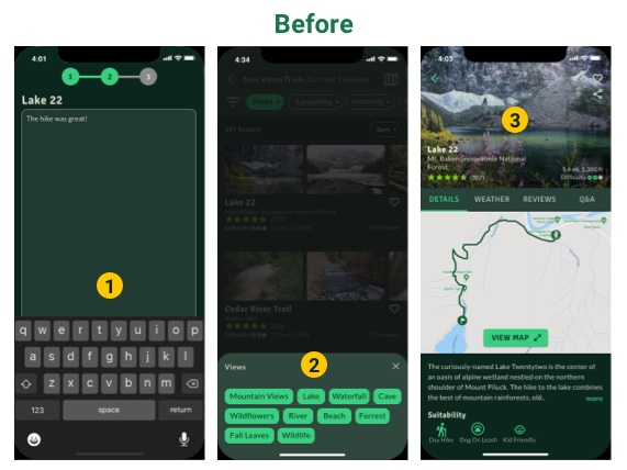
- I added the prompt but reduced the opacity to 30% and added a Continue button to allow users to exit the focus of the textbox.
- I removed the preselection to allow users to filter for the specific views and also added the Clear Selection button for an easier reset.
- I added an auto-scrolling gallery to provide affordance that the image is clickable. Also, I updated the back button background to a gray color to make it more visible against the changing image.
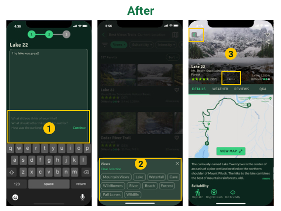
Round 2
I recruited 5 participants for the second round of usability testing. Two participants completed the testing in person. After the design update, no participants had trouble with the previous issues. However, there are 3 minor issues that I noticed in the behaviors in round 2 of testing.
- Several participants wanted to click into the overlay screen to exit the modal. However, the current design only allow exit by clicking the close button.
- Participants were unsure if their review had been posted. A simple notification would resolve the confusion of the posting status.
- When looking at the map view, a couple of the participants clicked on the trail title expecting to see the trail details. The simple update is to allow clicking on both the trail name and hiking icon to show trail details.
RETROSPECTIVE & LESSON LEARNED
It was an incredible and long journey during the design of HikeiT. However, I gained a lot of valuable experience. Below are the 3 main lessons learned.
- Do not be afraid to test out ideas and uncertainty with users. When I was not sure which color palette to choose for the high fidelity prototype, talking to people and asking for their preferences gave me the confidence to move on to the design.
- It is important to start usability testing as early as possible. For my project, 75% of the usability issues were discovered in the paper prototype stage.
- Simplicity is the best policy. Having a limited amount of font and color will keep the focus on the design and reduce the maintenance.